
A picture tells a thousand words but, in policy studies, those words are often misleading or unclear. The most useful images can present the least useful advice, or capture a misleading metaphor. Images from the most useful theories are useful when you already know the theory, but far more difficult to grasp initially.
So, I present two examples from each, then describe what a compromise image might look like, to combine something that is easy to pick up and use but also not misleading or merely metaphorical.
Why do we need it? It is common practice at workshops and conferences for some to present policy process images on powerpoint and for others to tweet photos of them, generally with little critical discussion of what they say and how useful they are. I’d like to see as-simple but more-useful images spread this way.
1. The policy cycle
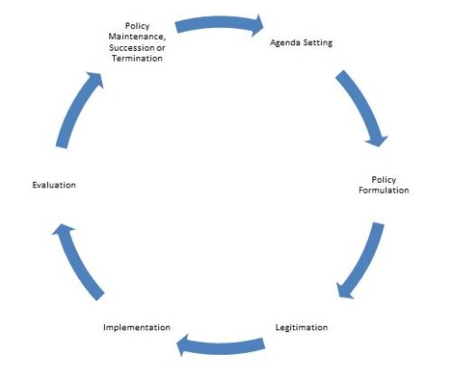
The policy cycle is perhaps the most used and known image. It divides the policy process into a series of stages (described in 1000 words and 500 words). It oversimplifies, and does not explain, a complex policymaking system. We are better to imagine, for example, thousands of policy cycles interacting with each other to produce less orderly behaviour and less predictable outputs.
For students, we have dozens of concepts and theories which serve as better ways to understand policymaking.
Policymakers have more use for the cycle, to tell a story of what they’d like to do: identify aims, identify policies to achieve those aims, select a policy measure, ensure that the selection is legitimised by the population or its legislature, identify the necessary resources, implement, then evaluate the policy.
As such, this story still pops up from time to time:
Yet, most presentations from policymakers, advisers, and practitioners modify the cycle image to show how messy life really is:
Update 18.2.20: I knocked this up one in my garage for the book The Politics of Policy Analysis. See in particular what you need as an analyst versus policymaking reality, which argues that the cycle (or 5-step policy analysis) describes what policy analysts would like to do (not what happens).

2. The multiple streams metaphor

The ‘multiple streams’ approach uses metaphor to describe this messier world (described in 1000 words and 500 words). Instead of a linear cycle – in which policymakers define problems, then ask for potential solutions, then select one – we describe these ‘stages’ as independent ‘streams’. Each stream – heightened attention to a problem (problem stream), an available and feasible solution (policy stream), and the motive to select it (politics stream) – must come together during a ‘window of opportunity’ or the opportunity is lost.
Many people like MSA because it contains a flexible metaphor which is simple to pick up and use. However, it’s so flexible that I’ve seen many different ways to visualise – and make sense of – the metaphor, including literal watery streams, which suggest that when they come together they are hard to separate. There is the Ghostbusters metaphor which shows that key actors (‘entrepreneurs’) help couple the streams. There is also Howlett et al’s attempt to combine the streams and cycles metaphors (reproduced here, and criticised here).
However, I’d encourage Kingdon’s space launch metaphor in which policymakers will abort the mission unless every factor is just right.
3. The punctuated equilibrium graph

Punctuated equilibrium theory is one of the most important approaches to policy dynamics, now backed up with a wealth of data from the Comparative Agendas Project. The image (in True et al, 2007) describes the result of the policy process rather than the process itself. It describes government budgets in the US, although we can find very similar images from studies of budgets in many other countries and in many measures of policy change.
It sums up a profoundly important message about policy change: we find a huge number of very small changes, and a very small number of huge changes. Compare the distribution of values in this image with the ‘normal distribution’ (the dotted line). It shows a ‘leptokurtic’ distribution, with most values deviating minimally from the mean (and the mean change in each budget item is small), but with a high number of ‘outliers’.
The image helps sum up a key aim of PET, to measure and try to explain long periods of policymaking stability, and policy continuity, disrupted by short but intense periods of instability and change. One explanation relates to ‘bounded rationality’: policymakers have to ignore almost all issues while paying attention to some. The lack of ‘macropolitical’ attention to most issues helps explain stability and continuity, while lurches of attention can help explain instability (although attention can fade before ‘institutions’ feel the need to respond).
Here I am, pointing at this graph:
4. The advocacy coalition framework ‘flow diagram’

The ACF presents an ambitious image of the policy process, in which we zoom out to consider how key elements fit together in a process containing many actors and levels of government. Like many policy theories, it situates most of the ‘action’ in policy networks or subsystems, showing that some issues involve intensely politicized disputes containing many actors while others are treated as technical and processed routinely, largely by policy specialists, out of the public spotlight.
The ACF suggests that people get into politics to turn their beliefs into policy, form coalitions with people who share their beliefs, and compete with coalitions of actors who share different beliefs. This competition takes place in a policy subsystem, in which coalitions understand new evidence through the lens of their beliefs, and exercise power to make sure that their interpretation is accepted. The other boxes describe the factors – the ‘parameters’ likely to be stable during the 10-year period of study, the partial sources of potential ‘shocks’ to the subsystem, and the need and ability of key actors to form consensus for policy change (particularly in political systems with PR elections) – which constrain and facilitate coalition action.
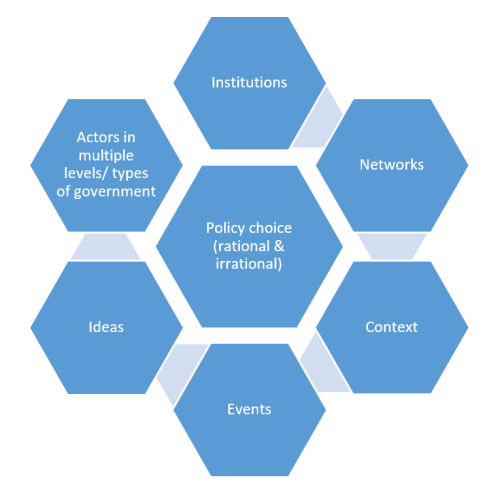
5. What do we need from a new image?
I recommend an image that consolidates or synthesises existing knowledge and insights. It is tempting to produce something that purports to be ‘new’ but, as with ‘new’ concepts or ‘new’ policy theories, how could we accumulate insights if everyone simply declared novelty and rejected the science of the past?
For me, the novelty should be in the presentation of the image, to help people pick up and use a wealth of policy studies which try to capture two key dynamics:
- Policy choice despite uncertainty and ambiguity.
Policymakers can only pay attention to a tiny proportion of issues. They use ‘rational’ and ‘irrational’ cognitive shortcuts to make decisions quickly, despite their limited knowledge of the world, and the possibility to understand policy problems from many perspectives.
- A policy environment which constrains and facilitates choice.
Such environments are made up of:
- Actors (individuals and organisations) influencing policy at many levels and types of government
- Institutions: a proliferation of rules and norms followed by different levels or types of government
- Networks: relationships between policymakers and influencers
- Ideas: a tendency for certain beliefs or ‘paradigms’ to dominate discussion
- Context and events: economic, social, demographic, and technological conditions provide the context for policy choice, and routine/ unpredictable events can prompt policymaker attention to lurch at short notice.
The implications of both dynamics are fairly easy to describe in tables (for example, while describing MSA) and to cobble together quickly in a SmartArt picture:
However, note at least three issues with such a visual presentation:
- Do we put policymakers and choice at the centre? If so, it could suggest (a bit like the policy cycle) that a small number of key actors are at the ‘centre’ of the process, when we might prefer to show that their environment, or the interaction between many actors, is more important.
- Do we show only the policy process or relate it to the ‘outside world’?
- There are many overlaps between concepts. For example, we seek to describe the use and reproduction of rules in ‘institutions’ and ‘networks’, while those rules relate strongly to ‘ideas’. Further, ‘networks’ could sum up ‘actors interacting in many levels/ types of government’. So, ideally, we’d have overlapping shapes to denote overlapping relationships and understandings, but it would really mess up the simplicity of the image.
Of course, the bigger issue is that the image I provide is really just a vehicle to put text on a screen (in the hope that it will be shared). At best it says ‘note these concepts’. It does not show causal relationships. It does not describe any substantial interaction between the concepts to show cause and effect (such as, event A prompted policy choice B).
However, if we tried to bring in that level of detail, I think we would quickly end up with the messy process already described in relation to the policy cycle. Or, we would need to provide a more specific and less generally applicable model of policymaking.
So, right now, this image is a statement of intent. I want to produce something better, but don’t yet know what ‘better’ looks like. There is no ‘general theory’ of policymaking, so can we have a general image? Or, like ‘what is policy?’ discussions, do we produce an answer largely to raise more questions?
Update: please compare with the turtle diagram, below, and explored in more depth here.

___
Here I am, looking remarkably pleased with my SmartArt skills


Pingback: Policy Concepts in 500 Words: The Policy Process | Paul Cairney: Politics & Public Policy
Pingback: Policy Concepts in 1000 Words: The Policy Process | Paul Cairney: Politics & Public Policy
Pingback: Three habits of successful policy entrepreneurs | Paul Cairney: Politics & Public Policy
Pingback: Why don’t policymakers listen to your evidence? | Paul Cairney: Politics & Public Policy
Pingback: How far should you go to privilege evidence? 2. Policy theories, scenarios, and ethical dilemmas | Paul Cairney: Politics & Public Policy
Pingback: Evidence-based policymaking and the ‘new policy sciences’ | Paul Cairney: Politics & Public Policy
Pingback: Policy Concept in 1000 Words: Multi-centric Policymaking | Paul Cairney: Politics & Public Policy
Pingback: A general theory of public policy | Paul Cairney: Politics & Public Policy
Pingback: Policy Analysis in 750 words: Using Statistics and Explaining Risk (Sincerely) | Paul Cairney: Politics & Public Policy
Pingback: Policy in 500 Words: Punctuated Equilibrium Theory | Paul Cairney: Politics & Public Policy
Pingback: Policy Analysis in 750 Words: what you need as an analyst versus policymaking reality | Paul Cairney: Politics & Public Policy
There cannot be a ‘general theory’ of policymaking as if we were dealing with an ontological category. The ‘images’ are artifacts that simplify a human process that is much more complex than a stage-heuristics diagram. Perhaps we can strive for developing a general theory for each of the dimensions that the policymaking process and phenomenon comprises
Yes, I follow up on that idea here: https://paulcairney.wordpress.com/2019/05/29/a-general-theory-of-public-policy/
Thanks!!
(sorry I pressed ‘Comment’ too early)
…and search for the overlaps and crossovers
Pingback: EUIdeas | Evidence and expertise in 21st century policy-making
Pingback: Policy Analysis in 750 Words: Two approaches to policy learning and transfer | Paul Cairney: Politics & Public Policy
Pingback: What does policymaking look like? - Public Policy Design
Pingback: What does policymaking look like? | Paul Cairney: Politics & Public Policy